Reeta R.

Improving Navigation Usability

A Benchmark Review of the Hamburger Menu

Overview

ROLE:

UX/UI Design

Timeline:
80+ hours


‍
Tools used:

Figma


This project is a fictitious scenario, completed as a Design review for Hamburger Menus for SWATCH

Description

The hamburger menu has become a widely adopted navigation pattern, especially for mobile experiences. Over time, many premium and luxury brands have extended this pattern to desktop to maintain visual minimalism and brand focus. However, usability research (including Baymard Institute findings) highlights clear trade-offs between aesthetics and discoverability.
This case study evaluates the hamburger menu pattern across devices, its impact on user behavior, and best-practice guidance for when and how to use it.

Project Goal

Client believe on a hamburger menu to organize primary and secondary navigation items. Project Goal was to enhance user experience with new approach and user can find key sections efficiently. Here we review the overall navigation style across devices. The goal is not to change the existing navigation entries but to analyze the current approach.

Maintain consistent navigation across devices by using a hamburger menu on mobile, tablet and desktop, aligning with user expectations for each platform.

What is Hamburger Menu?

A hamburger menu is a navigation pattern where most or all primary navigation options are hidden behind a single icon (☰) typically revealed through a drawer, slide-in panel or full-screen overlay.

Primary objectives of Hamburger menu are – Reduce visual clutter, Preserve screen space, Maintain a clean and minimal layout.

Design Process

Empathize

Empathize

Define

Define

Ideate

Ideate

Prototyping

Prototype

01. Empathize - Exploring the User’s Needs

During the empathize phase, I focused on understanding users need for a clean, distraction-free interface. Observations and user feedback showed that users primarily engage with the main content rather than navigation options and prefer an uncluttered screen, especially on smaller devices. Many users were already familiar with the hamburger icon and associated it with secondary navigation. They expressed appreciation for having less frequently used options tucked away, allowing them to focus on their primary tasks without visual overload. These insights indicated that a hamburger menu supports users by reducing cognitive load and keeping the interface simple while still providing access to additional features when needed.

02. Define - Establishing the User's Needs and Problems

After understanding users’ behaviors and preferences during the empathize phase, the key problem became clear. Users want to focus on the main content without being distracted by too many navigation options on the screen. This need is especially important on smaller devices, where limited space can make visible menus feel crowded and overwhelming.

Research showed that while users do need access to additional features, they do not require all options to be visible at all times. When too many navigation items are displayed, users experience confusion and increased mental effort, which slows down task completion.

Problem Statement
Users need a navigation solution that keeps the interface clean and simple while still allowing easy access to secondary options when needed.

03. Ideate - Creating the Framework

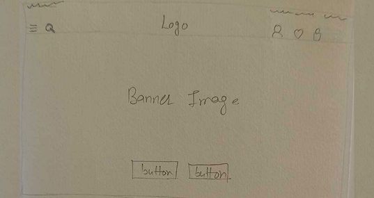
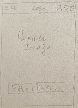
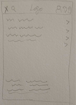
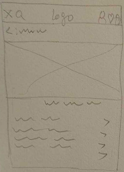
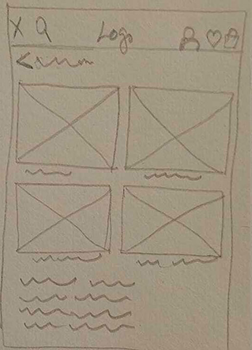
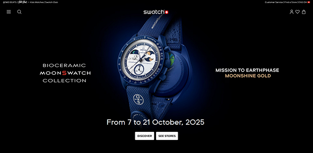
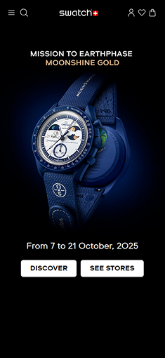
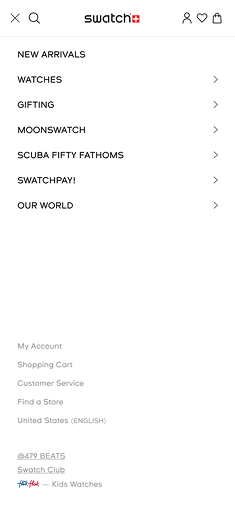
With a clear understanding of users’ needs for a clean, content-focused interface and a defined problem statement – how to provide navigation without cluttering the screen, we moved into the Ideate phase. The goal was to generate a variety of solutions that balance accessibility, familiarity and simplicity. Research showed that while users do need access to additional features, they do not require all options to be visible at all times. When too many navigation items are displayed, users experience confusion and increased mental effort, which slows down task completion.

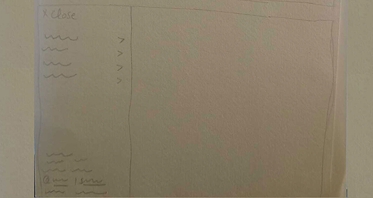
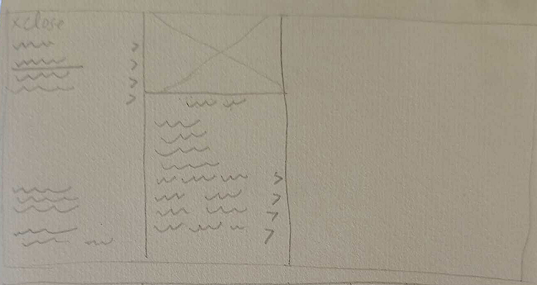
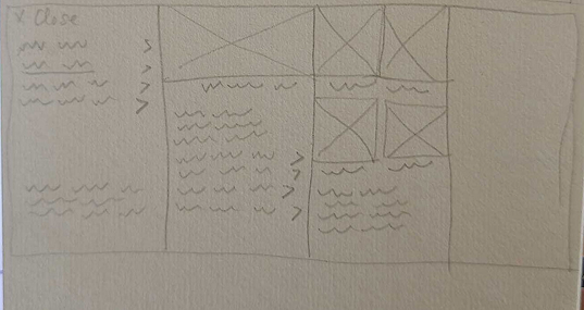
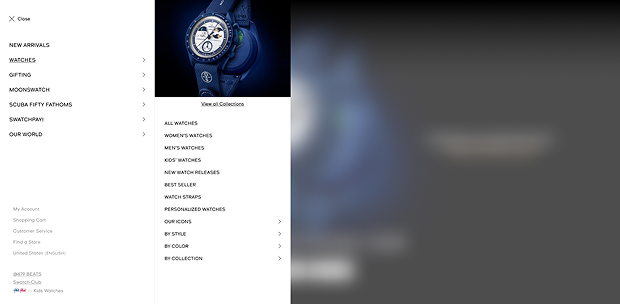
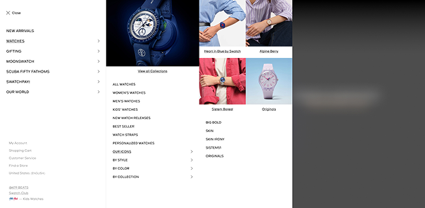
We explored multiple approaches to ensure the hamburger menu would meet user expectations.

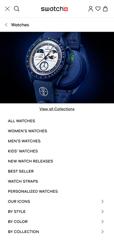
During brainstorming sessions, sketches, and wireframing exercises, we focused on user-centered principles: minimizing cognitive load, keeping navigation consistent across devices, and maintaining a familiar pattern that users recognize from other apps.

From this exploration the solutions that best aligned with our goals were those that preserved screen simplicity, ensured easy access to secondary features and could scale across mobile, tablet, and desktop platforms. These ideas formed the foundation for prototyping and testing, moving us closer to a navigation experience that truly supports user needs while staying intuitive and distraction-free.

04. Prototype - Let's make the Design!

After generating ideas in the Ideate phase, we moved to Prototyping to bring our hamburger menu concepts to life. The goal was to create tangible, interactive versions of our designs so we could test usability, layout, and overall user experience.

We developed low-fidelity wireframes first, focusing on:

  • Placement of the hamburger icon on mobile, tablet and desktop
  • How the menu expands and collapses
  • The hierarchy of navigation options inside the menu

Low Fidelity Designs on Desktop

Home Page

Main Menu Column 1

Sub Menu – column 2

Sub Menu level – column 3

Low Fidelity Designs on Mobile

Home Page

Main Menu Column 1

Sub Menu – column 2

Sub Menu level – column 3

Next we created interactive Hi-fidelity prototypes using design tools allowing users to click, tap, and navigate through the menu as they would in a real application.

Hi-Fidelity Designs on Desktop

Home Page

Main Menu Column 1

Sub Menu – column 2

Sub Menu level – column 3

Hi-Fidelity Designs on Desktop

Home Page

Main Menu Column 1

Sub Menu – column 2

Sub Menu level – column 3


By prototyping we could quickly gather feedback, observe how users interacted with the menu and refine the design before final development. This step ensured that the hamburger menu not only looked good but also worked effectively for real users, reducing cognitive load and improving navigation efficiency.

reeta rani

Reeta Rani

Creative Lead - UI/UX

Designed with heart and a few sleepless nights

Disclaimer!

These designs are shared purely to showcase my work and experience. They don’t suggest ownership or any present partnership with the brands or companies featured.